One of the images that stuck out for me this summer! A quick sketch.
|
One of the images that stuck out for me this summer! A quick sketch.
0 Comments
I love this time of the year. It's still great outside, the schools reopen, the anticipation of the fall and all the goodness that follows after. Wide eyed monkeys get ready for school! 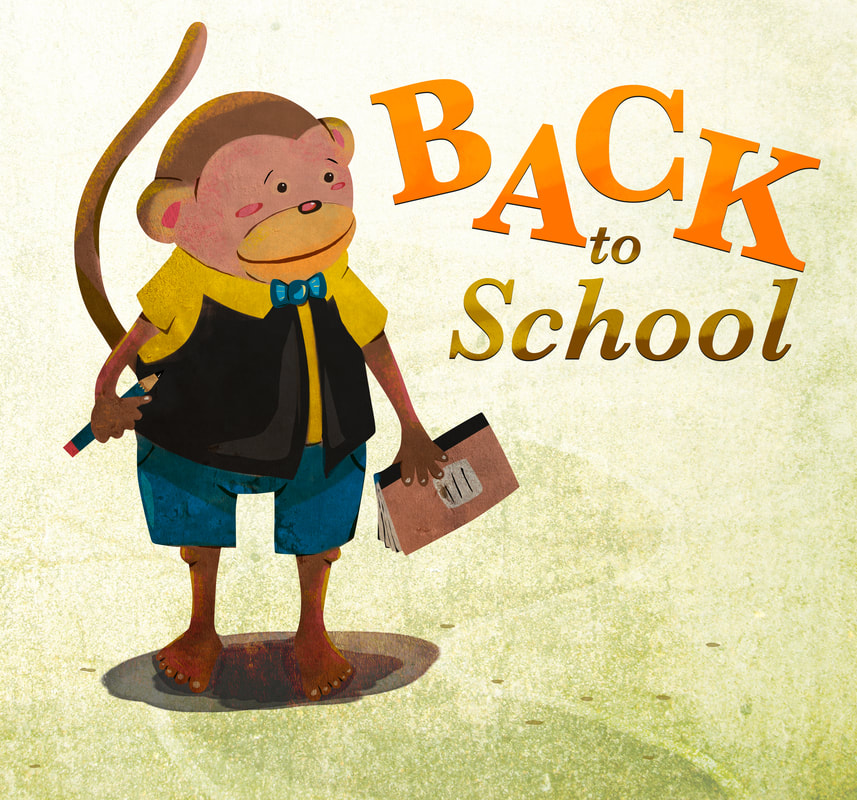 It's been a busy few weeks at StudioTikli. From illustrating for a book on yoga for a client to making a foray into publishing, it has been hours of research, reading and implementing. I've enjoyed every minute of it! The StudioTikli blog reaches over 300 people now and although it may not seem like a big number, the list continues to grow at a steady pace. Today, I wanted to take a minute to thank you for reading, responding and encouraging me at every step. It has been invaluable to me! Here's a cool little monster to brighten up your day. You can print him out and color him in! Or just put the colored version up to brighten up your day. I'd love to see the results so send them in when you're done! Click on the image below to download the printable file! 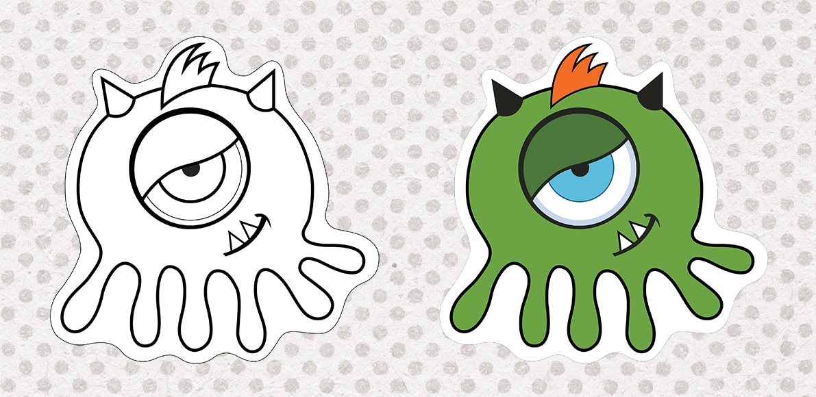 Watch out for Monster 2!
Talk soon! Whew! We've come to the final part of this series! In this post, I will talk about why Logo design can cost hundreds of thousands of dollars. I am going to make it as short as possible so enjoy!
Talk soon! So we're done with Part-1 and Part-2 of the series! Yay!! Part-3 of this series covers the questions your Graphic Designer needs to ask you before assuming what you need and jumping into it. The more questions the better but here are the basic 10!
We're almost there. In the final part, Part-4, I will cover why Logo design can run into hundreds of thousands of dollars so hang tight!
Pro Tip: With the fancy printing technology now, many effects can be incorporated in Logos. They can be made with gradients and have 3D or metallic effects. Whatever you choose, make sure the Logo looks good in flat colors and Black and White! Trust me, when it comes to usage as, let's say, watermarks, the simpler version is going to go a long way. Hope you enjoyed the first part of the 'Designing a Logo' series. As promised, here is Part 2. Today, we're covering the types of Logos and why you need to think about what kind you need. There are essentially 3 broad types of logos
1. Lets look at what a Word Mark is: A Word Mark is when typically the name of the business is given a unique type treatment to represent the idea behind it.
2. Letter Mark A Letter Mark is usually an abbreviation of a longer name. It covers the initials of the name of your business/company.
3. Symbol Mark As the name, Symbol Mark, suggests it is a unique graphic that represents the company. This can be literal but often it can represent the feeling behind what the company/business it trying to achieve. In the infancy of a business, this type of logo is used as a Combination Mark - Symbol+Name of the Company. Sometimes the name of the company can be dropped if it is acknowledged and recognized widely.
Pro Tip: Always think about everywhere the Logo is going to go in advance - on buisness cards, on marketing collateral, on t-shirts and even on a billboard. The more you think about the placement, the more clarity you will get on the type of Logo you need. Hope this helps. The Part 3 of this series is relatively short will cover the questions your graphic designer needs to ask you before jumping into the design process. Talk soon! Today, I am going to demystify the world of Logos and the design process for you. Well, the first part anyway. I am a big fan of articles broken down into short, easy to consume capsules. They take a couple of minutes to read and absorb till the next part comes along. So take a deep breath and read on. Here goes Part - 1...
What a Logo is
What a Logo is not
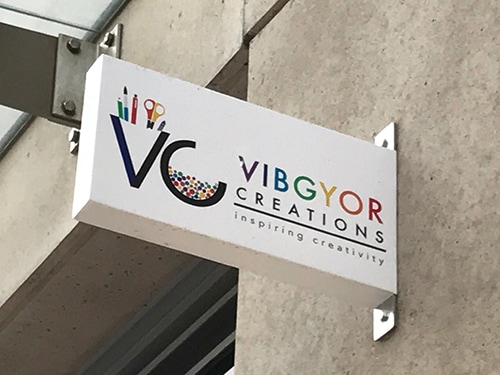
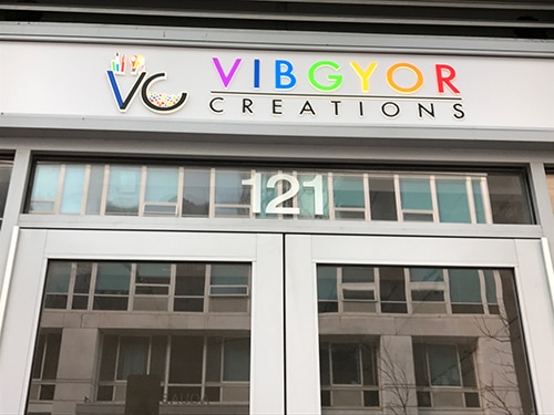
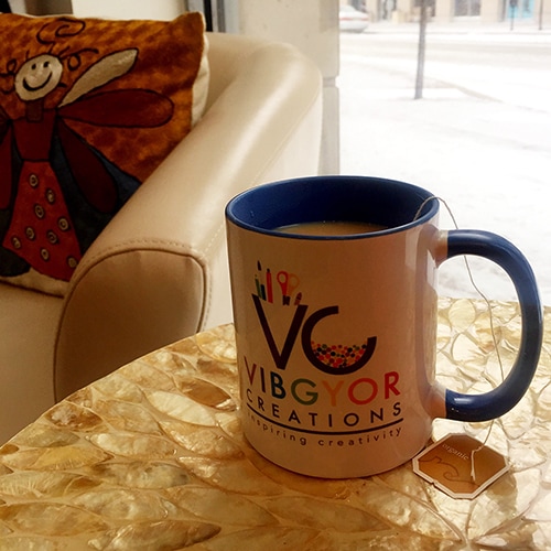
I will let you absorb this introduction and will be back with Part - 2 tomorrow. We will talk about the types of Logos with examples of each type. Talk soon! I want to share an exciting story with you today. Not just because it is about a significant and fun project for me but because it is about a wonderful, heart-centric, strong entrepreneur that I had the privilege to work with. Nothing, I mean nothing, makes me happier than working with people like her. These are my tribe, my peeps. They are the ones who take risks and live full, robust lives. They support others in the community and rejoice in their successes.
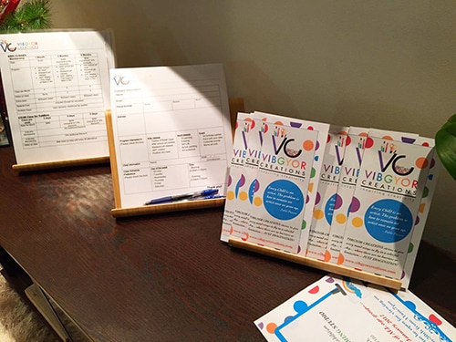
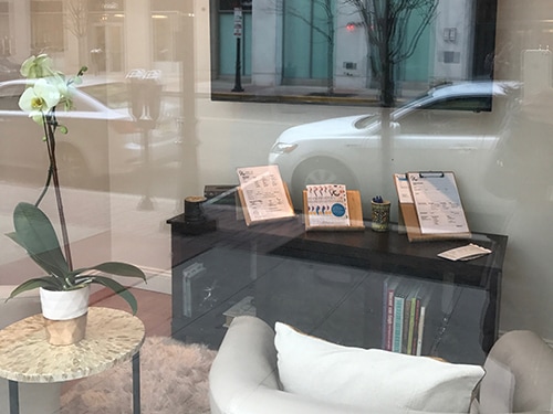
Starting a business (especially a brick and mortar business) is a scary thing. There are risks and unknowns. After the initial consultation, we came up with a solid project brief with the type of logo, company colors and the core values. The she loved the end result and what she has done with the studio and the signage just took my breath away! Coming next: Tips on designing a logo for your business.
Have you ever been stumped getting your voice across? Struggled to get your marketing message or material just right? Whether you are working with a designer or creating your marketing material yourself, keeping in mind a few basic guidelines will help you convey your message with confidence. It can be frustrating but stick with me and read on. 1. Start with the text - Always It's so tempting to start with the dimensions and the format of the marketing collateral first. And although it might seem like good strategy, it really isn't. Write the copy first and get the message crystal clear. It will make deciding the format and the type of material that much easier. It will save you time and a ton of frustration. 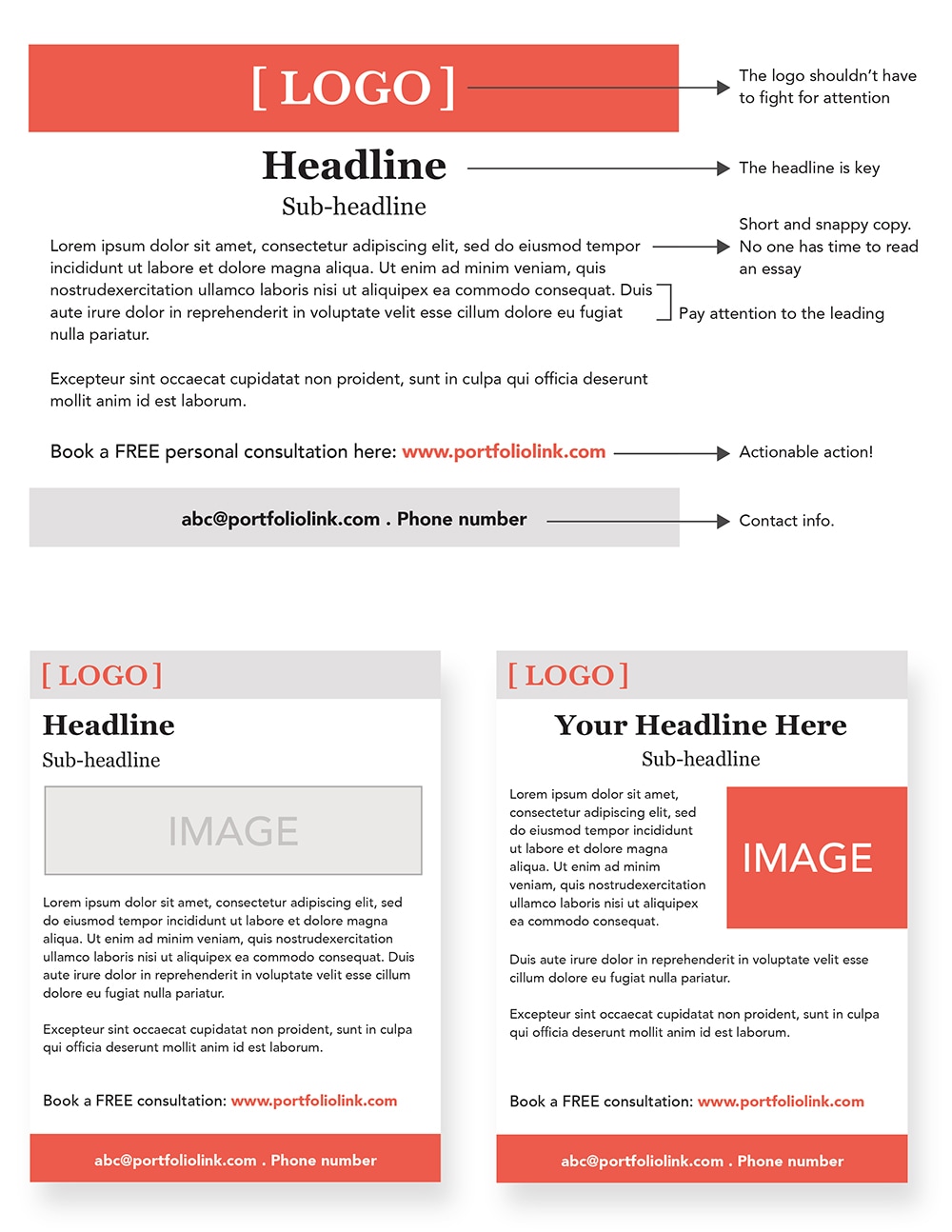 2. The Logo (if available) is sacred
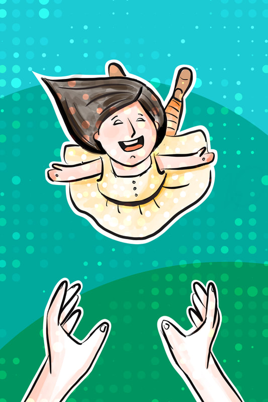
Your logo (along with your message) is how people recognize your business/service. It is often a reflection of what you do, your ideals and principles. If it is getting pushed and pulled and squeezed while fighting with the text all at the same time, the purpose of the entire exercise is lost. Place the logo, preferably left aligned or center aligned with adequate and equal spacing around it. Give it it's very own moment every chance you get and let it shine. 3. The Headline says it all Consider your headline a capsule of your main message. It is akin to the subject line in a letter or an email. It's main purpose is to draw the reader in and have them read the body copy. Make it compelling and urgent. 4. Type of type Choose classic, well designed, readable fonts. You could have a limited use of fancier fonts but don't write the entire copy in italics. The type has one and only one purpose - to convey your message. Make it as pleasant and clear for the reader as you can. Depending on the font, try and keep the leading the font size+5pts. And remember, no widows and orphans. 5. Number of acceptable fonts Limit your use of fonts to 2 (3 at the maximum). The Headline and the body type can vary for distinction. I would recommend that it does. This is one time you can use Serif and Sans Serif fonts together and have it look great! 6. Short and snappy Make your message short and snappy. I was at the Guggenheim over the weekend and I loved it! Right from the round Frank Lloyd Wright building to the carefully curated artwork, everything serves a purpose - to take you from start to finish. It is short, snappy and an exhilarating experience. Your copy needs to do exactly that - it needs to be well designed and short to consume and with ease (lets face it, no one has time to read an essay). 7. Actionable action You may have seen actionable buttons in the online world - the 'Learn more' links to the 'Buy Now' buttons. These are super critical. They get the message across and direct the user to where you want them to go. Similarly, even if you are working on a print project, always have and action in the end - a task that you want the consumer to do, a place with resources, a contact address. And tell them in clear words what you want them to do. Actionable action! Hope this helps. Talk soon! Be Proud! A part of the new Yoga series, the Mountain Pose is one of my favorite poses. I love that at any point of the day, I can stand tall, close my eyes, relax my shoulders and rock back and forth on my feet to find my balance. https://www.etsy.com/shop/StudioTikli 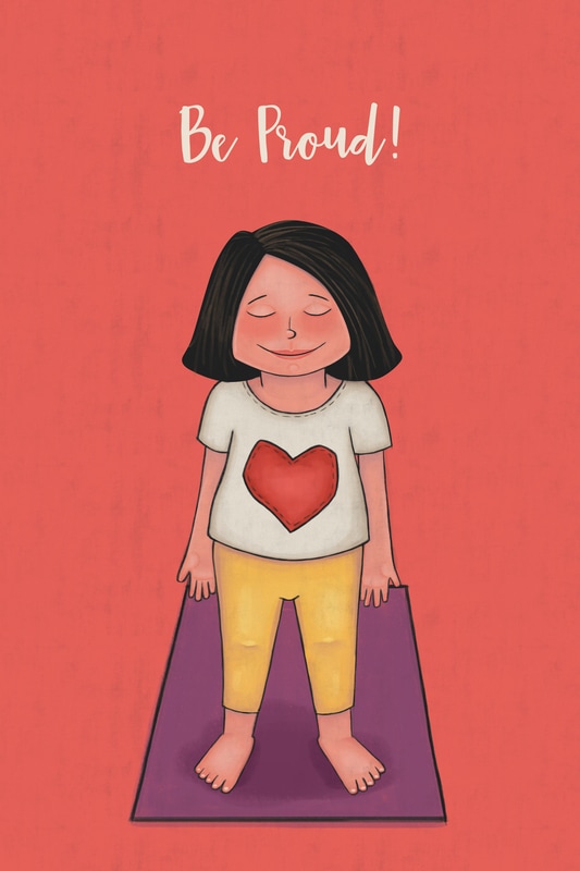 |
Ready to talk?
|